Light is what lets you experience color.
Light color value is a combination of factors artists use to control what you see.
People who are color-blind are not able to respond to certain wavelengths of light.
- They may be unable to see red, green or blue.
- Some people can only see grays, white and black.
- Some animals - bees, for example - are sensitive to light waves that people cannot see.
Light Color Value Vocabulary
chiaroscuro
color-blind
contrast
dull
expressive
hue
intensity
intermediate
light
primary
relation
retina
secondary
shade
spectrum
tint
value
The retina inside the normal human eye has pigments (coloring agents) that are sensitive to different lengths of light waves.
- The colors you see as red have long wavelengths.
- The colors you call blue have short wavelengths.
- The wavelengths you see as green are medium length.
The wavelengths of light that humans can see are called the visible color spectrum. You see this spectrum in a rainbow. The spectrum was first identified by Sir Isaac Newton. He found that a prism splits sunlight - white light - into colors. A prism is a clear wedge - shaped form. A color wheel shows the spectrum of colors arranged in a circle.
In order to use color expressively, artists learn some of the following basic facts and terms about color.
Many are easiest to remember by using a color wheel diagram.
-
Hue refers to the common names for the colors in the spectrum: red, orange, yellow, green, blue and violet.
-
A pigment is a coloring agent such as paint or dye that reflects certain wavelengths and absorbs others.
-
White pigments reflect all wavelengths equally.
-
Black pigments absorb almost all wavelengths.
Artists refer to differences in light or dark as differences in value.
- Values can be changed very gradually to create shading. They can be used to create a strong contrast, or difference, in areas of light and deep shadow. You can change the value of any color by adding white.
- A light value is called a tint. To darken a color, add black.
- A dark value of a hue is called a shade.
- Artworks dominated by tints are called high key works. They are usually seen as cheerful, bright and sunny.
- Low key artworks are dominated by dark values. They are often seen as dark, mysterious or gloomy.
- Sudden changes in value from light to dark create contrasts. Strong contrast is called chiaroscuro (Italian for light and dark). Chiaroscuro gives a work drama or excitement.
- Gradual changes in value can make it appear that there are shadows on a form, or that the atmosphere is misty or that the mood is calm and quiet.
Primary hues in pigments are red, yellow and blue.
- These hues cannot be mixed from other hues.
- With the primary hues, along with black and white, you can mix almost every color.
Secondary hues - orange, green and violet - are mixed from primary hues.
- You mix red and yellow for orange, red and blue for violet, and yellow and blue for green.
Intermediate colors are mixed from a primary hue and secondary hue that is next to it on the color wheel.
- You mix red and orange for red-orange, blue and violet for blue-violet and so on.
Color interactions can be used to create expressive qualities in artwork.
- For example, complementary hues such as blue and orange tend to “vibrate” and create visual excitement if placed side by side.
- Changing the value or intensity of hues changes the expressive quality.
- Simultaneous contrast refers to the way you perceive one hue in relation to another. For example, a yellow- orange square in the middle of an orange square will appear to be more orange than if it is in the middle of a yellow square. A dull or muted blue will look brighter on a gray background.
Intensity refers to how bright or dull a color is.
- Bright, high-intensity colors are like those in the spectrum.
- Mixing complementary colors (colors that are opposite each other on the color wheel) creates dull, or low-intensity, colors.
- If you mix a small amount of green with its complement red, the red looks duller.
- Many grays, browns and other muted) neutral colors can be mixed from complements.

Preparedness
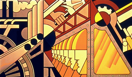
by Roy Lichtenstein shows light color value.