Andy Warhol
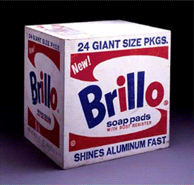
Brillo Box
by Andy Warhol
Andy Warhol background
"Andy Warhol began as a commercial illustrator, and a very successful one, doing jobs like shoe ads for I. Miller in a stylish blotty line that derived from Ben Shahn. He first exhibited in an art gallery in 1962, when the Ferus Gallery in Los Angeles showed his 32 Campbell's Soup Cans, 1961-62. From then on, most of Warhol's best work was done over a span of about six years, finishing in 1968, when he was shot.
And it all flowed from one central insight: that in a culture glutted with information, where most people experience most things at second or third hand through TV and print, through images that become banal and disassociated by repeated again and again and again, there is role for affectless art.
|
You no longer need to be hot and full of feeling. You can be supercool, like a slightly frosted mirror. Not that Warhol worked this out; he didn't have to. He felt it and embodied it. He was a conduit for a sort of collective American state of mind in which celebrity - the famous image of a person, the famous brand name - had completely replaced both sacredness and solidity. Earlier artists, like Monet, had painted the same motif in series in order to display minute discriminations of perception, the shift of light and color form hour to hour on a haystack, and how these could be recorded by the subtlety of eye and hand. |
Warhol's thirty-two soup cans are about nothing of the kind. They are about sameness (though with different labels): same brand, same size, same paint surface, same fame as product. They mimic the condition of mass advertising, out of which his sensibility had grown. They are much more deadpan than the object which may have partly inspired them, Jasper Johns's pair of bronze Ballantine Ale cans. This affectlessness, this fascinated and yet indifferent take on the object, became the key to Warhol's work; it is there in the repetition of stars' faces (Liz, Jackie, Marilyn, Marlon, and the rest), and as a record of the condition of being an uninvolved spectator it speaks eloquently about the condition of image overload in a media saturated culture. Warhol extended it by using silk screen, and not bothering to clean up the imperfections of the print: those slips of the screen, uneven inkings of the roller, and general graininess. What they suggested was not the humanizing touch of the hand but the pervasiveness of routine error and of entropy..."
- From "American Visions", by Robert
Hughes (http://www.artchive.com/artchive/W/warhol.html)
Origins of Pop Art
"Pop" stands for popular. The term Pop Art first appeared in print in an article by the British critic Lawrence Alloway, "The Arts and the Mass Media," which was published in the February 1958 issue of Architectural Design. Although Pop art is usually associated with the early 1960s (Time, Life, and Newsweek magazines all ran cover stories on it in 1962), its roots are buried in the 1950s. The first Pop work is thought to be Richard Hamilton's witty collage of a house inhabited by fugitives from the ad pages called Just What Is It That Makes Today's Home So Different, So Appealing? (1956). That work was first seen at This Is Tomorrow, an exhibition devoted to popular culture, by the Independent Group of the Institute of Contemporary Arts in London. The show that thrust Pop art into America's consciousness was The New Realists, held at New York's Sidney Janis Gallery in November 1962."
(originally quoted from the following link, but it is no longer posted:http://www.e-fineart.com/art_movements.html)
About Andy ...
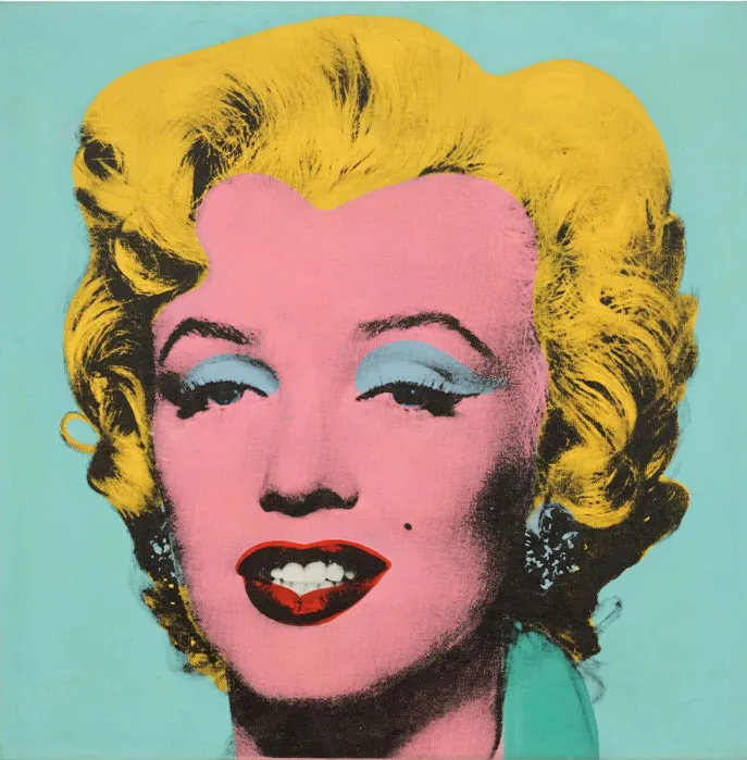
Andrew Warhola was born into a working class immigrant family in Pittsburgh, Pennsylvania. Part of his education included training commercial art. He moved to New York where he worked as an illustrator. His next step into the art world was in a 1962 art exhibit in which he included his painting of 32 Campbell's soup cans. He quickly moved on to a series of Marilyn paintings and silk-screens.
In the mid-60s he held a studio on New York which became knwon as the Factory. Many musicians and artists vistied him there and made images, films and music. In 1968, one of the visitors to the studiio shot Andy in the abdomen. He survived and showed pictures of his gunshot wound. He continued making art and money until he died from complications from a surgery.
Pop art links:
You may visit various web sites, including the following, for more information about pop art:
http://www.artchive.com/artchive/W/warhol.html
http://images.google.com/images?q=Andy+Warhol&hl=en&lr=&client=safari&rls=en&sa=N&ta b=ii&oi=imagest
https://nga.gov.au/art-artists/the-kenneth-e-tyler-collection/artists/andy-warhol/
https://www.centrepompidou.fr/en/recherche?terms=warhol
Assignment - Andy Warhol
Warhol Assignment
• Answer this questionnaire about Andy Warhol and his art:
(All written work should be typed in an ordinary font, size 10 or 12, and double-spaced. )
- What does “pop art ” mean?
- When was the pop art period of art?
- Who are some of the main proponents of pop art?
- Where was Andy Warhol prominent?
- How did pop art develop? (What did it respond to? What events or phenomena helped pop art come about? What was the main focus of pop art?)
- Why didn’t pop art continue as a preeminent style of art?
• Write a "description" paragraph about one work of visual pop art.
• Remember that writing about art includes three types of writing:
- Description
- Interpretation
- Evaluation
• Write a report about pop art; write about …
• An artist; or
• An artwork; or
• The movement’s legacy on twentieth century art; or
• The general history of pop art.
• List your reference sources in a bibliography and or a "works
cited" section.
• Create a pop art image. Try to imitate the ideas, themes and style of Andy Warhol.
- Use common images from everyday culture;
- Use bold, flat colors and hard edge designs;
- You may appropriate "pop" images from newspapers, magazines and the Internet (example);
- You may reframe and critique cultural ideas.
Use these technical guidelines:
- • 7” x 8.75”
• 300 ppi
• CMYK
• White background
• Consider including an image of yourself in the artwork.
• Print your artwork on photo quality paper.
"The creative process, so far as we are able to follow it at all, consists in the unconscious activation of an archetypal image and elaborating and shaping the image into the finished work. By giving it shape, the artist translates it into the language of the present and so makes it possible for us to find our way back to the deepest springs of life." - Carl Jung
Okay, so now I've put on some ads from Amazon - from which I may earn a few cents. (2025)
