Light, Color, Value
Design Elements: light, color, value
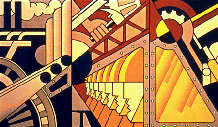
Preparedness
by Roy Lichtenstein - shows light, color, and value.
|
Light is what lets you experience color. Light, color, and value is a combination of factors artists use to control what you see. |
People who are color-blind are not able to respond to certain wavelengths of light.
| |
|
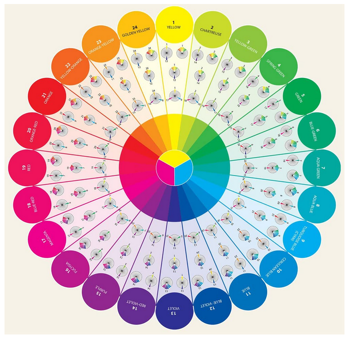
In order to use color expressively, artists learn some of the following basic facts and terms about color. Many are easiest to remember by using a color wheel diagram.
|
The retina inside the normal human eye has pigments (coloring agents) that are sensitive to different lengths of light waves.
The wavelengths of light that humans can see are called the visible color spectrum. You see this spectrum in a rainbow. The spectrum was first identified by Sir Isaac Newton. He found that a prism splits sunlight - white light - into colors. A prism is a clear wedge - shaped form. A color wheel shows the spectrum of colors arranged in a circle. | |
|
Artists refer to differences in light or dark as differences in value. Values can be changed very gradually to create shading. They can be used to create a strong contrast, or difference, in areas of light and deep shadow. You can change the value of any color by adding white. A light value is called a tint. To darken a color, add black. A dark value of a hue is called a shade. Artworks dominated by tints are called high key works. They are usually seen as cheerful, bright and sunny. Low key artworks are dominated by dark values. They are often seen as dark, mysterious or gloomy. Sudden changes in value from light to dark create contrasts. Strong contrast is called chiaroscuro (Italian for light and dark). Chiaroscuro gives a work drama or excitement. Gradual changes in value can make it appear that
there are shadows on a form, or that the atmosphere is misty or that the
mood is calm and quiet. |
Primary hues in pigments are red, yellow and blue. These hues cannot be mixed from other hues. With the primary hues, along with black and white, you can mix almost every color. Secondary hues - orange, green and violet - are mixed from primary hues. You mix red and yellow for orange, red and blue for violet, and yellow and blue for green. Intermediate colors are mixed from a primary hue and secondary hue that is next to it on the color wheel. You mix red and orange for red-orange, blue and violet for blue-violet and so on. 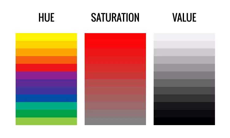 | |
|
Color interactions can be used to create expressive qualities in artwork.
|
Intensity refers to how bright or dull a color is.
|
Vocabulary for this topic:
chiaroscuro, color-blind, contrast, dull, expressive, hue, intensity, intermediate,
light, primary, relation, retina, secondary, shade, spectrum, tint, value
Okay, so now I've put on some ads from Amazon - from which I may earn a few cents. (2025)
