Design Principle - Unity and Variety
Unity
Unity is the feeling that everything fits together. It is a feeling of oneness. The opposite of unity is disunity, a feeling of disorder.
- In art, unity is often achieved by the repetition of a shape, a color or another visual element.
- Another method is simplicity. Simplicity is the use of one major color, kind of shape or element to unify a work.
- In a third technique, called harmony, related colors, textures, materials might be combined. A fourth technique is theme and variation. In this case, an artist might organize a work around one major element like a circle, then include variations on the circle - showing it in different sizes and colors, or including some half-circles.
Variety
|
Variety is often said to be the spice of life.” In art, variety is like a spice. A totally unified work is likely to be boring if it has no variety. |
 |
|
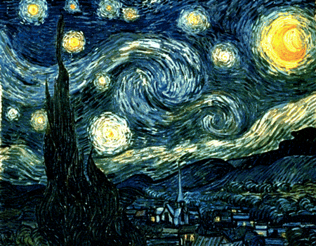
Starry Night by Vincent Van Gogh |
Variety is the use of contrasting elements to make something interesting.
- The contrast, or difference, may be subtle, such as a slight change in texture or color within an area.
- It may be more obvious, such as a sharp difference in the materials, sizes of shapes, color or lighting.
- Just as we appreciate unity and variety in nature, we seem to want unity and variety in our lives - and in our art.
|
Sometimes works are unified by proximity or continuity. |
Proximity means that parts are grouped together, enclosed or clustered into sets. |
Continuity means that edges of forms are lined up so your eye moves from one part to another in a definite order. |
What other works of art show unity and variety?
Okay, so now I've put on some ads from Amazon - from which I may earn a few cents. (2025)
