Design Element - Color Schemes
Color Schemes as a design element
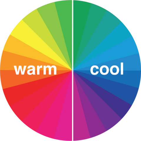
Color schemes are often used to unify artworks. Some of the most common schemes, or plans, for using color are noted below. These plans are based on impressions you have when you see different colors.
|
Warm Reds, oranges and yellows remind you of warm things and feelings such as fire, sun or people with “sunny” personalities. |
 |
Cool Blues, greens and violets remind you of cool things such as water, or moods of people such as “feeling blue.” |
Neutral

True neutrals are grays, black and white. Artists, designers, and architects often refer to varieties or brown as neutral colors. Neutral colors can be slightly warm — rust, reddish gray, tan. These colors are often used to suggest the idea of warm earthy nature. Neutral colors can also be slightly cool — brownish violet, greenish gray, light gray-blue. These colors may remind you of very business-like, industrial or “cool,” impersonal things. When neutral colors of about the same value are the main ones used in a work, it usually has a quiet, somber reserved quality. Any bright colors will tend to standout as accents or centers of interest.
Monochromatic

These color schemes are based on several values of one hue. Monochrome means “one color.” This kind of plan unifies a work, but it can also be monotonous. Artists and designers often use color accents or a related hue to add visual interest.
This example to the right starts with a deep pinkish color and then adds more and more white; adding white is a color "tint."
Analogous

In this plan, colors have a common hue. Green, yellow-green and blue-green are an example. Analogous hues are next to each other on the color wheel. They are usually pleasing to look at. You tend to see them as related or part of a unit.
In this plan, colors have a common hue. Blue, blue-green and blue-violet are an example. Analogous hues are next to each other on the color wheel. They are usually pleasing to look at. You tend to see them as related or part of a unit.
Complementary
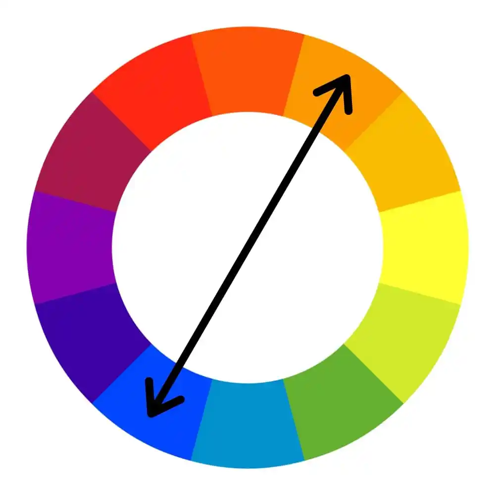
This color scheme uses hues opposite from each other on the color wheel. Intense pairs of complements tend to attract your attention. Complements seem to “sing” on “shout.” They are often used for signs and other commercial designs to attract attention. They can also be -the source of strong afterimages. An afterimage occurs when you stare at color for thirty seconds or so and then close your eyes or look at a white paper. You will see an afterimage of opposite on complementary colors. The eye seems to create these sensations as a way to rest.

Split Complement
This scheme is often more interesting than complements. A split complement includes one hue and the two hues on each side of its complement. An example would be yellow with red-violet and blue-violet.
Triad

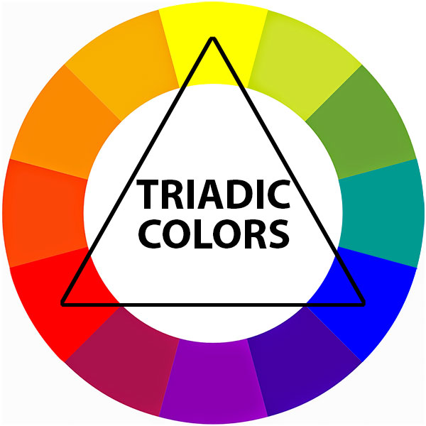
A triad is based on any three colors spaced at an equal distance on the color wheel. Examples are the primary colors (red, yellow, and blue), the secondary colors (orange, green, and violet) or other sets such as yellow-orange, red-violet and blue-green. Intense triads, like intense complements, seem to attract attention, especially if one hue is stronger than others. For quieter effects, artists may use a triad with neutral colors or change the intensity or value of colors in the triad.


